Typography
& Colors


Timma is a well-known booking service for searching, comparing and booking beauty and wellnesss services.
Timma’s booking form could be adapted to the request and integrated to any website, so lot’s of Finnish salons in beauty industry use it.
I noticed some UX and UI issues in there. So I decided to propose a new solution with which it could be improved.
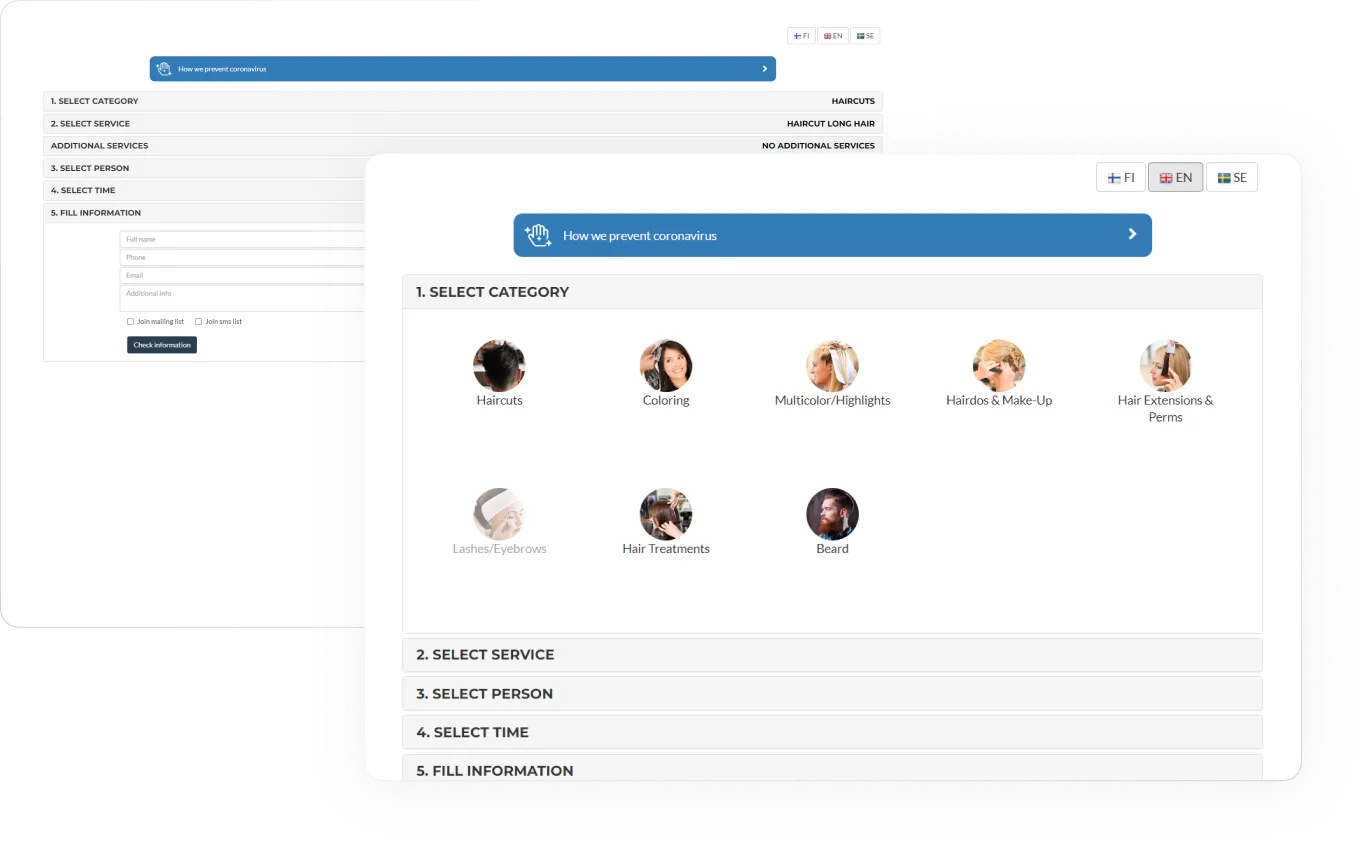
There are some screenshots of the initial form appearance without any changes
I have identified main categories, and the procedures related to them have been
placed in separate branches — it simplifies choice on the first step.
Option to choose specific specialist placed separately
In the new design choosing specialist is optional. Design also allows to review specialists ratings and nearest time the specialist is available
In order to to make selecting individual options faster, you proceed on this stage just right when you choose first option but can add other options further
Here you choose the main service and proceed to the next step immediately as well
In the redesigned version there’s a possibility to choose multiple additional services, check total info and edit services chosen
Сommon practice of calendars makes it more intuitive and simple to choose a date. Division into periods of day also speeds up the selection process
In the new design I’ve changed placeholders to inputs for better usability and marking mandatory fields.
There is also a live form validation that doesn’t distract or annoys when filling out the form but makes it possible to understand what exactly is incorrect if the error occurs
Сheckout with all general information is also added to the redesign — it is shown on the same screen after the contact info, and it is possible to remove some services, add others or select a specific specialist.